In our previous data issue, we defined some types of data, and explored ways to think about data. This time, we’ll get more hands on, with an example of manipulating and analyzing tabular data in Google Sheets. We’ll mess with Pivot Tables and formulas like VLOOKUPs, and discuss what Spreadsheets are great and not so great at doing.
Working with tabular data and spreadsheets
Any data that can fit into rows and columns is tabular data, which includes lists and measurements, survey responses, and more.
Tabular data is the most common kind of data that labs work with, and spreadsheets are the ideal tool collecting, analyzing, understanding, and visualizing tabular data. That’s why brushing up our spreadsheet skills once in a while is so important.
I’ve been revisiting my spreadsheet and data visualization skills by reading the book “Hands-on Data Visualization” (get it here — it’s free! https://handsondataviz.org/). This post is heavily inspired by Chapter 2 of the book, but instead uses public Phage Directory data.
I highly recommend that everyone — Regardless of your spreadsheet experience — at least skim “Chapter 2: Strengthen Your Spreadsheet Skills”. If at any point, this post gets too confusing, read through Chapter 2 and you should be good.

Fig 1: Hands-On Data Visualization is a great book that covers the entire range from data design to storytelling, cleaning, to charting and publishing data on the web. I would highly suggest to every biologist and data scientist. Get it here, it’s free: https://handsondataviz.org
Everyone reading this blog has probably used a spreadsheet (99% of you probably have at least one spreadsheet open as you’re reading this). But when was the last time you used a Pivot Table or VLOOKUP? It’s been a while for me (I even forgot to use those for our State of Phage series and instead wrote a bunch of custom code 🤦).
Starting with an example
For this post, I built the following example as a way to practice my Google Sheets skills. I’m sharing this is a post to give you a gist of what my process of working in a spreadsheet looks like. It’s written to be as helpful as possible, but might fall short of a full tutorial. As always, if you get lost, please read Chapter 2 of the book to get up to speed!
For this data journey, I decided to look at all public organizations that have filled out phage collection information on Phage Directory.
Get the example sheet on Google Sheets:
https://docs.google.com/spreadsheets/d/1ZqLKWpKLV1Jg_dwfZf6-sas4IqqAzHaClgtxtqz80cg
(go to File > “Make a Copy” to play with it yourself)
If you want to skip ahead, or get really lost, here is the “solutions” sheet (but don’t peek before you’ve tried it yourself!):
https://docs.google.com/spreadsheets/d/1PilL_3hQQ3UOxcvRRABfpaiExH6yjEOMf746bqcDzk4
(go to File > “Make a Copy” to enable pivot tables)
In this example, I’ve created an Organizations sheet to show name, description and organization type of each organization that’s publicly listed on our Phage Directory website. I’ve also created a PhageCollections sheet to show the organizations that have filled out their phages.
As always, before working with any data — make a mental note of the caveats. The Phage Directory data is fairly out of date and biased towards self-reporting. Thus, it might not paint an accurate picture of the current, global state of phage collections. Heck, it probably doesn’t even paint a good picture of the labs we’ve indexed, anymore. But this doesn’t mean it’s not interesting!
Combining two sheets of data with VLOOKUP
(Reminder: This example acts as a refresher of Google Sheets formulas, VLOOKUP, and pivot tables. For a full tutorial, read Chapter 2 of this book)
The first thing I want to know is “how many phage hosts has each organization listed on PD?” To start, we need to combine the columns from the Organizations sheet with the PhageCollections sheet. For this, we’ll use the VLOOKUP formula.

Fig 2: Our first goal is to match the organizations (left sheet) to the phage collections (right sheet), so we can look at the phages that belong to each lab.
To start, copy the column names from PhageCollections (People, Organizations, Hosts) into the Organizations sheet. We now use the VLOOKUP formula, which “finds and pastes matching data from another sheet”. Using the formula =VLOOKUP(D2,PhageCollections!A:F,2,false) will grab the data from the People columns of the PhageCollections sheet into the Organizations sheet. To get the Organizations and Hosts columns, copy the formula into the other columns, and increment the index from “2” to “4” to grab the 4th (People) column. Now do the same for Organizations and Hosts columns. Drag the fill handle (bottom-right corner of a cell) to fill the rest of the rows.
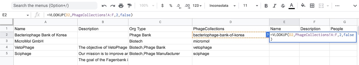
Fig 3: Using the VLOOKUP formula to pull the Name, Description, and other columns from the PhageCollections sheet into the Organizations sheet.
You’ll end up with columns that look like Fig 4. Remember, our goal is to figure out the number of phage hosts per organization. Hosts are stored in a comma-separated text in the Hosts column, so we’ll need to count up the number of items in that text. Let’s create a new column called “Number of Hosts”, and use the following formula to count up the hosts: =COUNTA(split(I2,",")). The split function splits up each comma-separated value, and the “COUNTA” function counts those values and outputs a single number. Drag the fill handle (bottom-right corner of a cell) to fill the rest of the rows.
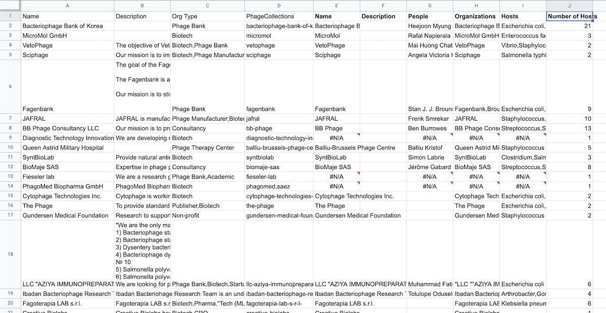
Fig 4: After counting up your hosts, your data should look something like this. Column J counts up all the hosts listed in the Hosts column. Now we can look at some numbers!
Making sense of numbers with Pivot Tables
The first thing we could do is sort the number of hosts in descending order. We can see that Mikroliz Biotech have the most listed, at 25 phage hosts. The de la Fuente lab has 22 hosts, and the Phage Bank of Korea has 21 hosts.
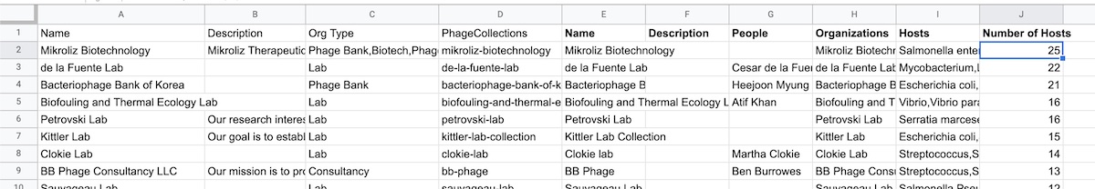
Fig 5: Phage organizations sorted descending by number of phage hosts.
Ok this is great, but what if we wanted a list of all organizations labeled as “Lab” with the most phage hosts? Let’s use a pivot table. In Google Sheets, go to Insert > Pivot Table, and create it as a new sheet. Add “Org Type” by ascending order and “Number of Hosts”, by descending order as Rows to your pivot table. Under Values, add Name, summarized by “COUNTA”. We’re counting the number of Org Types for each “Number of Hosts.” Your results should look something like Fig 6.
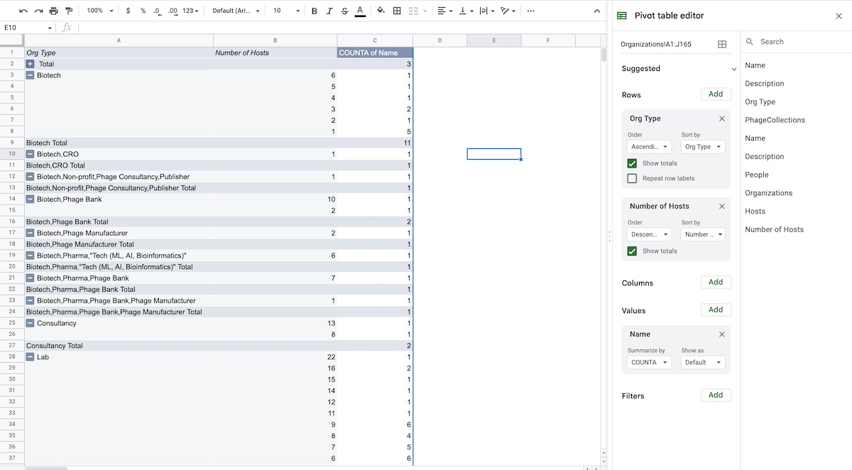
Fig 6: Pivot table counting how many Org Types exist for each Number of Hosts. For example, one “Biotech” is listed with 6 phage hosts, one “Lab” with 22 phage hosts; two “Labs” with 16 hosts, another “Lab” with 15, etc…
If we add Name as a row, we can now see the organizations’ names listed for each Number of Hosts category, as shown in Fig 7.
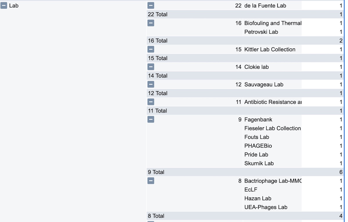
Fig 7: We now add Name as another row, to see the exact breakdown of each Org Type category. You can keep adding columns and rows in pivot tables to reveal more insights about your data.
We could go further. Notice how in Figure 6, the Org Types are “incorrect” because the Org Types are comma separated and not unique. This means that “Biotech” is treated as a different group than “Biotech, CRO.” Instead, we want all organizations labeled “Biotech” to appear in host counts. To create a proper pivot table, we need to create a list of values that matches each Org Type for each Organization. For example, Creative Biolabs is listed as both a Biotech and a CRO. We need to create two rows, where Creative Biolabs is separately listed as a Biotech and a CRO:
| Org Type |
Org Name |
| Biotech |
Creative Biolabs |
| CRO |
Creative Biolabs |
Start by moving the Org Type column to the right of the Number of Hosts column, so that Org Type is now column J. This is necessary because the next step will create a number of columns based on how many items exist in the comma-separated Org Type. Click on the Org Type column to highlight it, then click on Data > “Split text to Columns.” Now each type is now broken down into five columns, from J to N. Now we need to combine this these separated “Org Types” with “Org Names”
Add two more columns to the left of column J, and call these “Split Org Type” and “Split Org Name.” We create two columns to the left of J, because constantly scrolling to the last column can be annoying; in our example we only generate 5 columns, but in other use cases we could generate hundreds!
We can now create a new list where each organization type is associated with an organization name. To do this, we create a formula that creates an array of filters: ={ filter({L2:L, A2:A}, len(L2:L)); filter({L2:L, A2:A}, len(L2:L)) } which pairs up each org type in column L with the Organization Name in column A. This The results are shown in Fig 8.
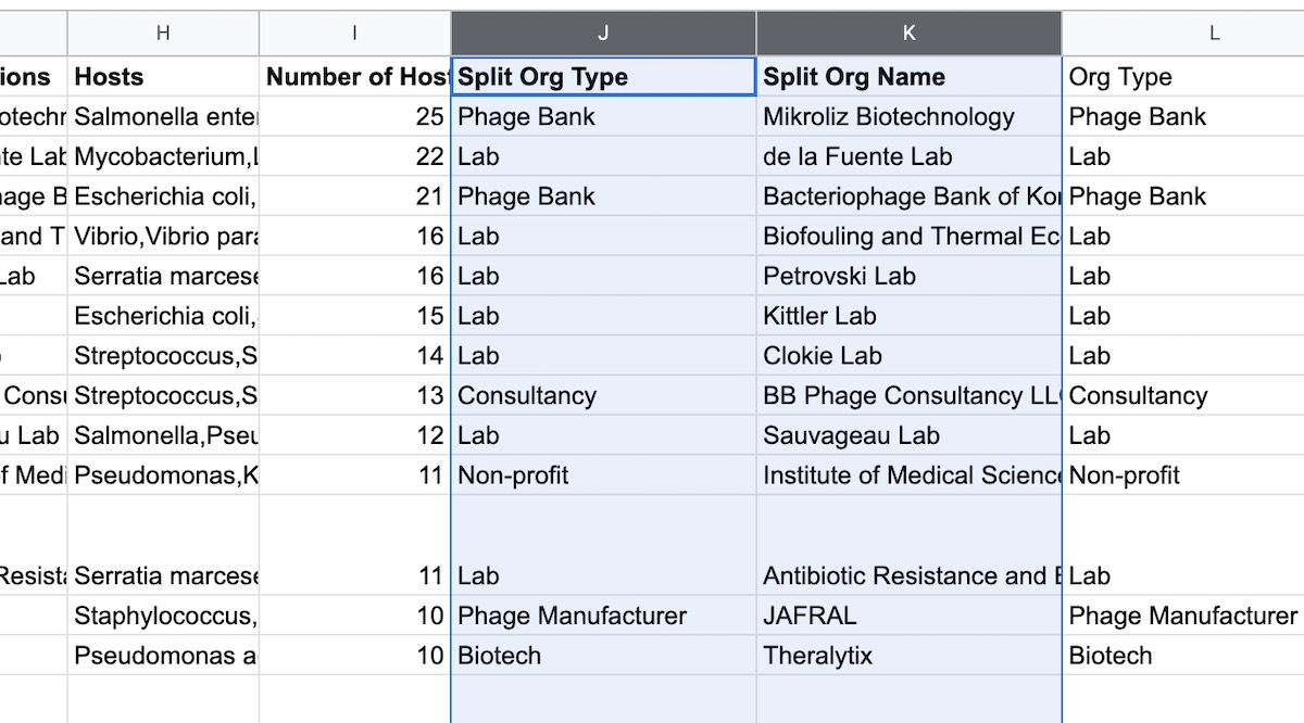
Fig 8: We can split up the comma-separated Org Type column into separate rows of Split Org Type, Split Org Name pairs. This lets us use the pivot tables again!
In our example, “Split text to Columns” only created five extra columns (L through P). What if you had many dozens? We need to manually type each “filter” row in the formula, which could become tedious! This is where you can “cheat” and ask ChatGPT to complete the formula for you, as in Fig 9. Handily, ChatGPT even explains what it’s doing, and how the formula works. ChatGPT rarely makes mistakes at these types of clearly-defined, repetitive tasks.
(I actually got the original idea to use filter/len as the formula from ChatGPT in the first place. It’s a great tool, even if it makes a lot of mistakes)

Fig 9: Using ChatGPT to “cheat” and expand our formula from earlier to cover columns L through O. Each line that starts with “filter” covers each column of organization types we’d want in the final output.
Here’s the final array filter formula used to generate the new Split Org Type and Split Org Name lists:
={
  filter({L2:L, A2:A}, len(L2:L));
  filter({M2:M, A2:A}, len(M2:M));
  filter({N2:N, A2:A}, len(N2:N));
  filter({O2:O, A2:A}, len(O2:O));
  filter({P2:P, A2:A}, len(P2:P))
}
Using the previous instructions for generating Pivot Tables using the new Split Org Type, Split Org Name as rows in the new pivot table. (I’m using the ”I now leave this as an exercise to the reader” as an excuse to not type this part out)
In this new pivot table, we can see that each organization type is properly broken down, as illustrated in Fig 10. We also have new numbers now, as Theralyx is listed as the “leader” with 10 phage host.
Take a peek at the results and the breakdowns in the Solutions sheet, labeled as “Pivot Table 2”. If you get stuck setting up the pivot table, click the “Edit” button bottom left corner to pull up the settings (it can be a bit hard to find).
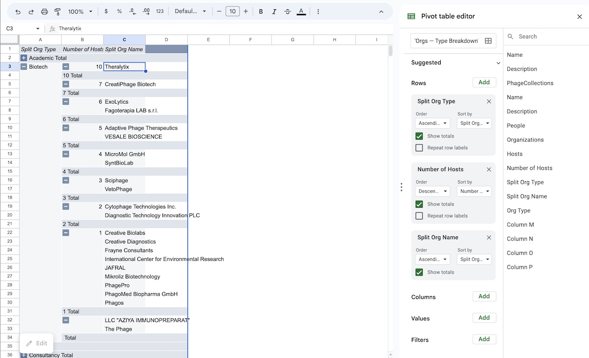
Fig 10: A pivot table with the organization types broken down properly into groups. Host and org name counts have been hidden for conciseness.
Spreadsheets are great for analysis, but not great as source of truth
Working with tabular data in spreadsheets is a lot of fun! The flexibility of spreadsheets can get us the information we need very quickly. But notice how many columns I’ve created and moved around in the process.
If everyone in the lab worked off of the same “source” spreadsheet, it’d become an absolute mess.
If everyone copied the spreadsheet every time they analyzed data, their own versions wouldn’t get the latest data updates. They’d have to copy the spreadsheet and redo all the steps, every time there’s new data.
What we need is a spreadsheet that acts as a “main source of truth.” It should always have the latest information. The data should be easy to copy. The data should be easy to analyze and understand — but it should not easily become messy.
This “spreadsheet source of truth” should have plenty of VLOOKUPs — so the Organization sheet can see all the host data — but the PhageCollections sheet could also see data in Organizations. And when a PhageCollection gets updated, the Organization data gets updated, and vice versa. And even better: what if when the source of truth is updated, everyone else’s data analysis would be updated too, without having to copy and re-analyze the data?
Spreadsheets are still my go-to place for playing with and understanding data — but I don’t use it as a source of truth. I share a lot of data across teams, and store most data within databases.
Databases lets you automagically connect sheets (called “tables”) together. You can combine columns from one table into another (lookups), perform calculations (like rollups and counts), and more. You can also create “views” different columns, sorts, and filters, then export them to CSV or copy and paste the data into a spreadsheet for analysis (which is what I did for this exercise).
Databases have a lot of pros and cons which make them great partners with spreadsheets. In the next Data issue, we’ll try to recreate our Organizations and Phage Collections example in Airtable, our favorite database tool — and discuss pros and cons of each tool. Stay tuned!