How do you turn subjective observations into a quantified, somewhat-less-subjective observations? This is persistent question in fields like psychology, sociology, and analytics. As a not-a-biologist, I’ve been surprised to see this question pop up in the lab, in the form of recording and “grading” spot tests. Is it clear? Is it hazy? Is it somewhat-hazy-but-mostly-clear-but-only-at-this-angle-in-this-lighting? In this very informal post, I’m here to introduce a simple concept: “Net Phage Score”. I’m not a biologist so I probably got a bunch wrong: you can publicly shame me on Twitter: @yawnxyz
How do spot tests work today?
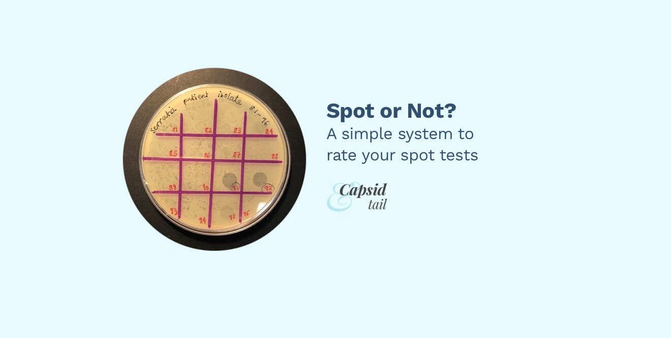
For the completely uninitiated: a spot test is a way to check if a sample of unknown liquid is able to kill a certain bacteria. Some bacteria is added to a Petri dish full of agar (”plate”) to grow. A drop of the liquid is added to the mix. If nothing killed the bacteria, the plate is a hazy khaki color, kind of like the color of your old chain-smoking aunt’s wallpaper. If the bacteria was killed, it looks like a circular, transparent-ish blob, called a “zone of clearing”. The clearing means the bacteria was unable to grow there. Here’s a standard spot test protocol from SEA-PHAGES.
Most of the time the plates range from “Didn’t work at all” (no clearing), “Kind of worked” (some clearing) and “really worked” (very clear).

Figure 1. Many groups break down their spot tests into three categories: “not clear” at all, “somewhat clear”, “very clear” This is usually fine! It’s a quick and dirty way of finding out which samples to continue to work on.
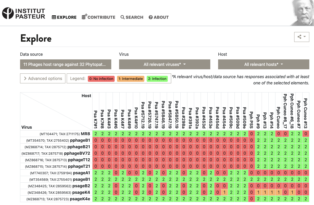
This is enough for some data collection systems, like the VHRDB (Viral Host Range DB) at the Pasteur Institute. To report host ranges, they report “0: no infection”, “1: intermediate infection” and “2: infection”. Here’s a virus vs. host matrix:

Figure 2. Example of the VHRDB’s grid of 0’s, 1’s, and 2’s in action. Source: VHRDB, Pasteur Institute
But sometimes — if many of your spots fall within the “Some Clearing” category, things get a bit hazy. Which phages do we proceed with to do further work? How do we document the range of different values encompassed by “some clearing”?

Figure 3. “Some clearing” is actually a really wide spectrum, which may or may not be useful for you.
The issue is that a lot of information is being “compressed” into the middle category. The group that’s considered “somewhat worked” is actually a large range of values, from “barely worked” to “mostly worked”. This is of course really subjective — how do you quantify this information? And why would you?
Only choosing phages that “clearly worked” might exclude a whole range of phages too early. In terms of finding phages for a patient, it’s not immediately clear that these phages won’t interact better in an antibiotic synergy kinetics test, or as part of a cocktail of multiple phages, or in the actual patient, compared to the phages that plaqued clearly on a plate.
Examples from the wild
Let’s take a look at how subjective opinions are dealt with in the wild.
Likert Scales
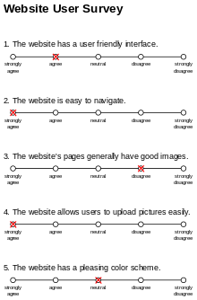
Popular in social science, psychology, and marketing, these scales show up often in questionnaires and website user surveys. You’ve probably filled one out before.

Figure 4. Example of a Likert Scale. Source: Wikipedia
Likert scales usually have five options, ranging from “strongly disagree” to “strongly agree”. Sometimes they remove the “middle” or “neutral” option, so you’re forced to give a stance. In Likert scales, the wording of the question could bias the results. Likert scales also suffer from the “distance” problem because of the way we quantify our options. Is “neutral” really only one degree away from “agree”, and two degrees away from “strongly agree?” Problems arise when you average the results, because it doesn’t capture the nuance or “range” of the values. “Strongly degree” might be a value of 20, while “neutral” might only be a value 5.
Online Reviews
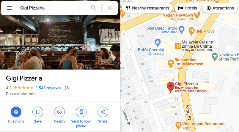
Online reviews are popular for buying online products (e.g. Amazon reviews) and looking up services (e.g. Google Maps restaurant reviews). We’ve all used these reviews at some point in our lives. Usually it’s a score between 1 and 5 stars. Usually all the reviews are aggregated into a single average score, with “number of reviews” listed on the side.
The number of reviews is really important: strength in numbers! A place with fewer reviews might not be as good as a place with thousands of reviews.

Figure 5. One of the best pizzerias in Sydney (plus, it’s vegetarian!). Source: Google Maps
Net Promoter Scores
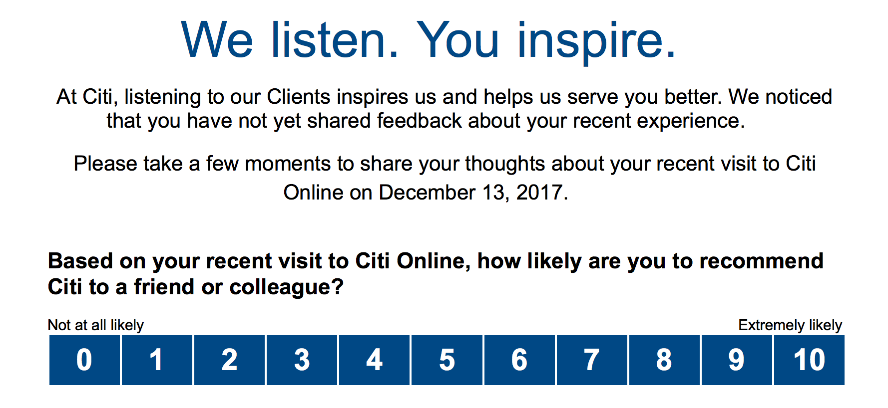
In product design, there’s the idea of the NPS (Net Promoter Score). You might have taken this survey before as well. Basically, you’re asked a single question: “How likely are you to recommend (our wonderful product)”, and to pick a score from 0 to 10. Usually, “promoters” are those who respond 9 or 10; “passives” are 7 or 8; and “detractors” are 6 or below.

Figure 6. Example of a Net Promoter Score from US-based Citi Bank. Article
Lots of marketing groups use the NPS to predict customer loyalty, and there are lots of supporters and detractors of the method. It doesn’t tell you why people are willing to recommend a product, and is actually kind of inaccurate and biased.
Incidentally, Jessica and I never really bothered to run an NPS score on Capsid & Tail readers! I do like the idea of an “approval cutoff score” of 7, which we’ll borrow.
Let’s make our own!
Ok, enough talk. We have enough examples to create our own system. Here’s what we want:
- Combination of NPS score and Google Reviews.
- No “middle” score, so we need an even number of options
- 1 star = No clearing
- 10 stars = Full clearing
- A way for many people to give a score
- Aggregation of all scores into an average score
- A cutoff value for whether we continue with the phage or not
I’ve made a quick demo you can try below!
When we look at the aggregate responses, we’ll probably only have a few scores, so it won’t really be statistically significant. A spot test with a high standard deviation could be “controversial”, as lab members might not agree on a value (would this actually happen?).
FYI, for my demo I’ve chosen Airtable as the underlying database, and Retool for the interface. The spot test I’m using is for an active Serratia phage therapy case for Phage Australia.
Figure 7. Demo app; Full demo link
What does it all mean?
It’s been a fun day exploring this idea further, and I’m cautiously optimistic about this approach. I’m not convinced this isn’t just over-engineering a really simple process, that already works fairly well.
There are quite a few drawbacks to introducing a process like this to spot assay readings. For example, it adds a complicated workflow to something that usually only one person does. It requires a clear image to be taken and uploaded, for the data to be parsed and entered into a database, and for several people to then give their opinions on your hard lab work. That all seems very complicated for a few numbers that can just be subjectively entered in by the lab person.
Whether or not any of this is useful I think comes down to the question: “how process-driven do you want your lab to be”? While some labs don’t need the extra process, others might embrace the documentation, formalization, and “informal peer review” of each spot test. After all, many eyes are better than one, and we get some accountability involved. But I’m not sure when (or if) we adopt such a workflow for Phage Australia. And of course, the demo described above will need to be expanded to include a spot test image upload interface, and the ability to rate multiple spot tests.
But wait, isn’t this just a thinly veiled data labelling interface for Machine Learning? If the spot test picture quality is high, we can definitely use this as a data labelling system to create a training set of spot test data! However, it seems kind of over-engineered, and definitely a solution in search of a problem… so I’ll leave that as a future exercise to the dear reader.
PS: if you actually want a system like this in place for your spot tests, email me at [email protected] or tweet at me (@yawnxyz). If enough people bother me to want this, I might build this into a mini, phone-friendly site or app!
Thanks to Jessica Sacher and Shawna McCallin for helpful conversations, and thanks to Stephanie Lynch for the plate image, which belongs to the Iredell Lab and Phage Australia.

